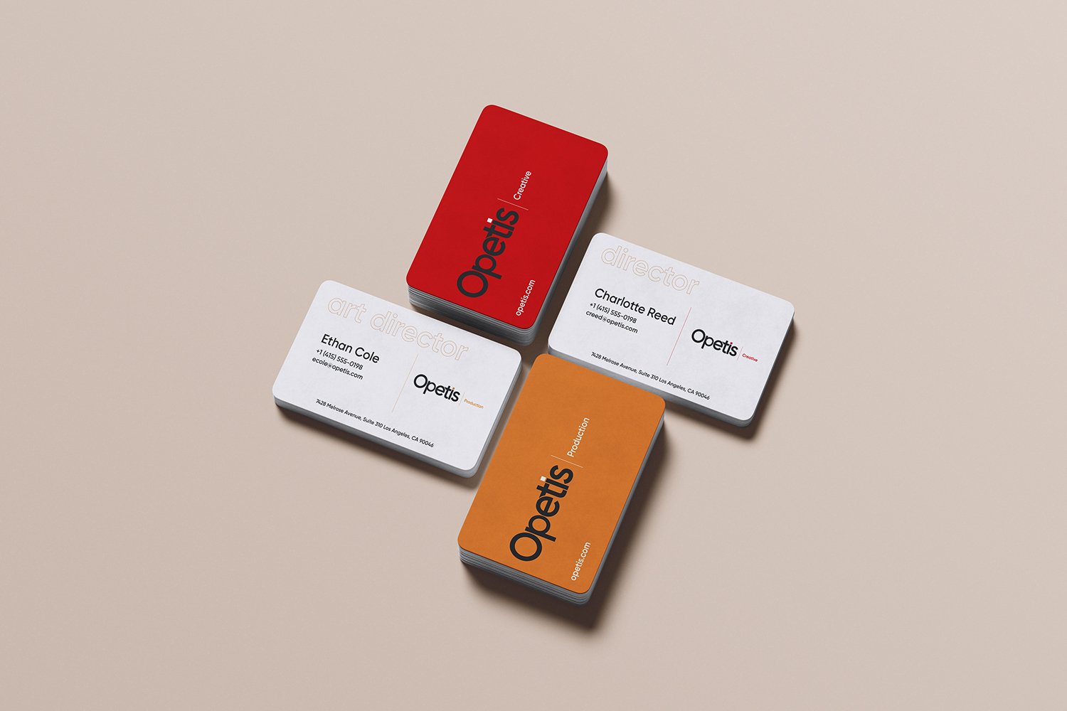
This brand identity is built on a clear dual-structure system: Creative and Production. Both operate under the same visual logic, yet each communicates a distinct mindset, function, and energy.
Creative represents strategy, concept development, and bold ideas. Its color language is rooted in deep charcoal, conveying intelligence, focus, and authority, paired with a strong, vivid red that expresses creative courage, intensity, and decisive thinking. This contrast reflects a discipline where ideas are not only imagined, but confidently owned and defended. The visual tone is sharp, assertive, and deliberately uncompromising.
Production focuses on execution, continuity, and tangible results. It shares the same deep charcoal to preserve structural consistency and brand unity, while introducing a warm amber tone that signals productivity, momentum, and hands-on craftsmanship. This palette emphasizes reliability and movement — a system designed to deliver, scale, and sustain.
Across all touchpoints — from business cards to stationery — the identity functions as one coherent system. The distinction is never decorative; it is functional. The brand does not explain itself loudly, but communicates through clarity, restraint, and confidence.